AVL Processing System Guide#
Getting started#
The TAO system can be accessed at https://\
The first page displayed when accessing the TAO
(https://\
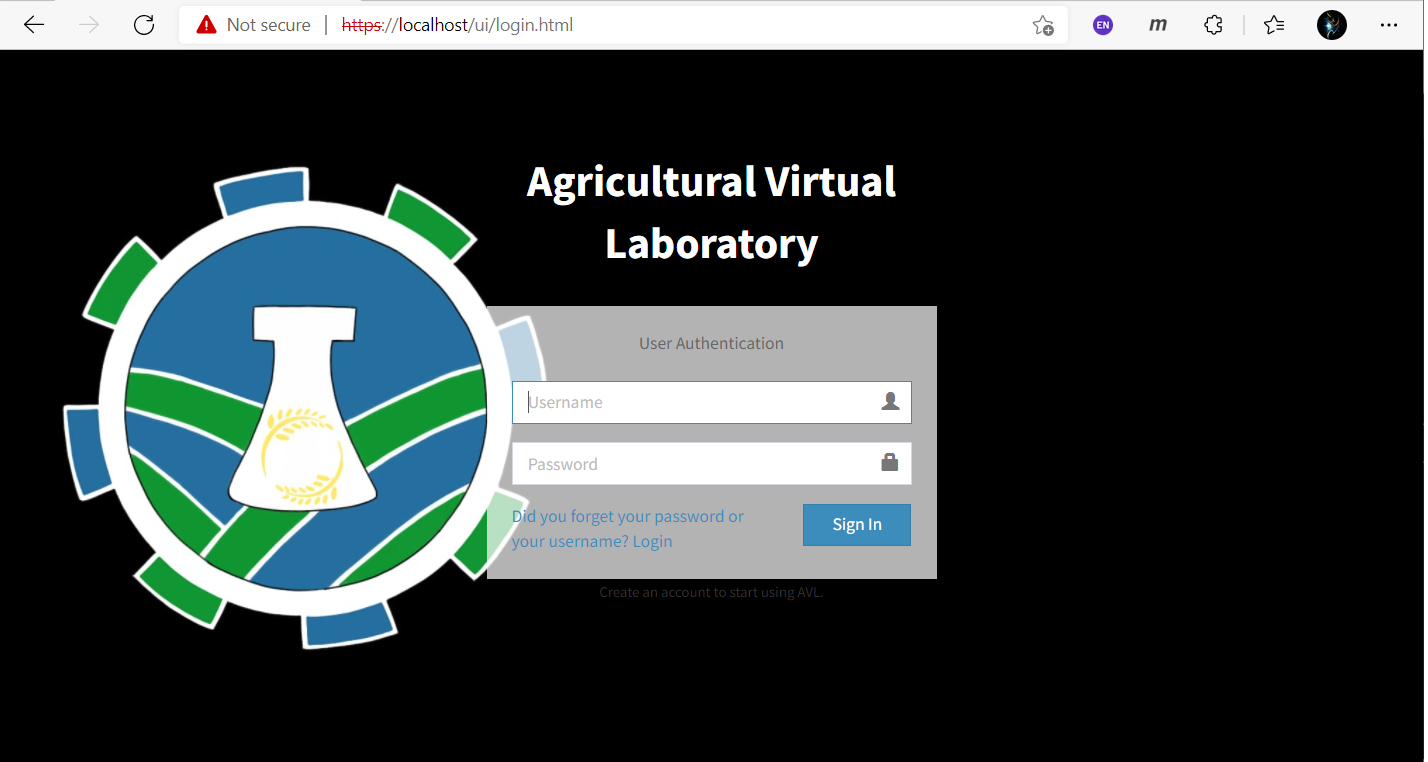
Figure 6‑1 TAO Login page
In order to access TAO, the user must be registered on the application. He has to authenticate with his username and password on the login page.
Any access of an URL of the web application when the user is not authenticated already is followed by a redirection to the login page.
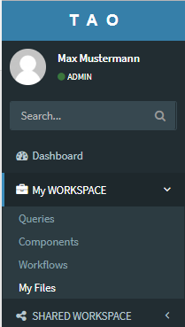
User Workspace#
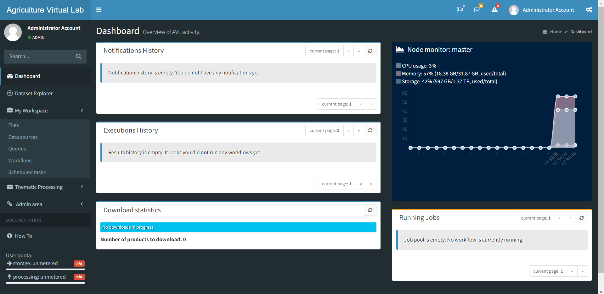
Dashboard#
System monitoring#
This interface allows the users to view the current status of a node (if it is available or offline), the execution status of a certain workflow (not running, executing, paused completed or in error), the status of a certain task in the workflow (not run, executing, finished or error) or the quota status for that user (percentage and the value of the disk space used).
It presents also general information about the platform/system status and synthetic overview about resources/load/nodes/activity.
The dashboard facilitates the access to different parts/components of the system/platform through menus.
 {width="1.1606266404199475in"
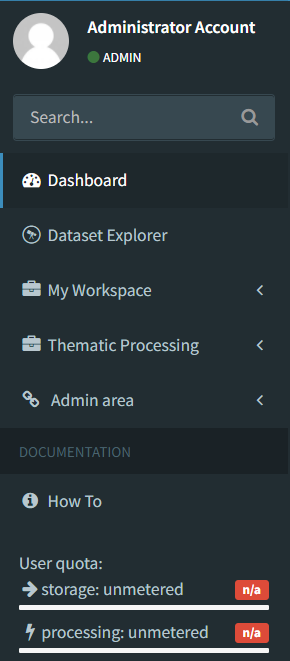
Figure 6‑2 Dashboard & menus
The Dashboard is the first page that is displayed to the user after the login. Within this view are available the following information:
-
The recent notification messages;
-
Information about the status of the TAO master node like the last start time, the number of processors of the master node, the memory used and a graphic about the processor and memory usage.
-
A summary information about the load of each processing node defined in TAO,
-
A list of workflows executing in this moment and the percentage of completion.
 {width="5.4921544181977255in"
height="3.04286198600175in"}
{width="5.4921544181977255in"
height="3.04286198600175in"}
Figure 6‑3 Dashboard view
Notifications#
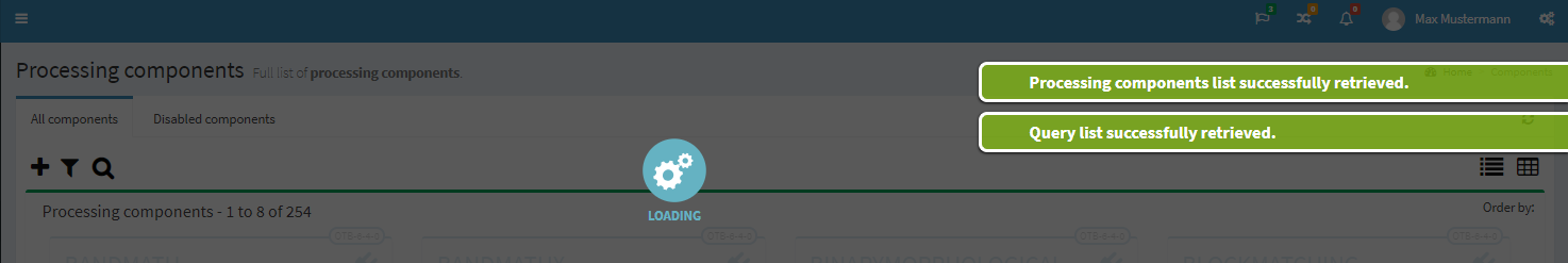
TAO offers a notification mechanism that informs the user about the status of the last operations performed. These notifications are displayed for several seconds as popups in the upper right side of the interface. The notifications can be general information messages or error messages.
 {width="5.178264435695538in"
height="0.8677274715660542in"}
{width="5.178264435695538in"
height="0.8677274715660542in"}
Figure 6‑4 Notifications popups
The error messages are also presented to the user upon validation of inputs.
 {width="4.999821741032371in"
height="0.9140212160979877in"}
{width="4.999821741032371in"
height="0.9140212160979877in"}
Figure 6‑5 Error message notifications
During the execution, can be also received notifications that are displayed in the Dashboard main page, as presented in the 'Figure 6‑3 Dashboard view\'.
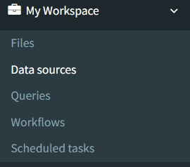
Data sources visualization#
The data sources can be managed from the "Workspace" -> "Datasources" menu:
 {width="1.2174923447069117in"
height="2.087969160104987in"}
{width="1.2174923447069117in"
height="2.087969160104987in"}
Figure 6‑6 Data sources menu
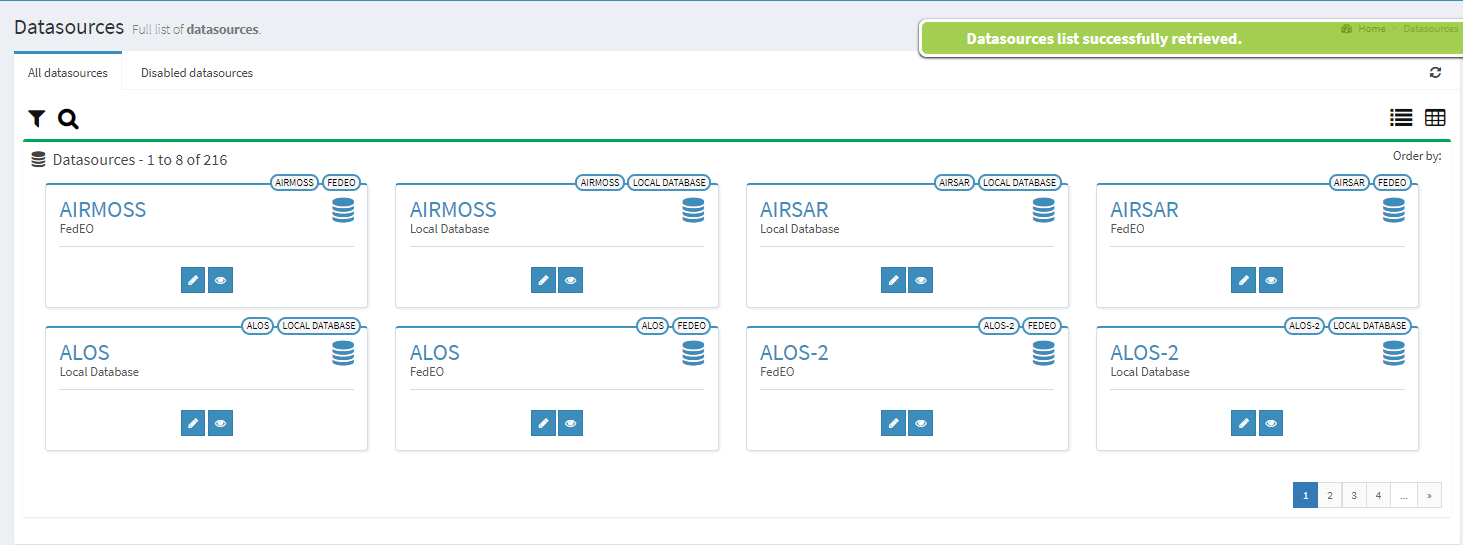
Within this page are listed the available data sources.
 {width="6.496527777777778in"
height="2.420100612423447in"}
{width="6.496527777777778in"
height="2.420100612423447in"}
Figure 6‑7 Data sources main page
Data sources cannot be added, deleted or edited from here. Instead, they are plugins of the TAO framework, which are detected at system startup (therefore, to add/remove a new data source, it is sufficient to put/remove the plugin JAR into/from the system class path).
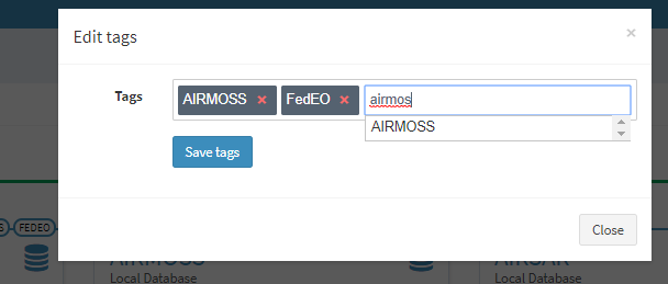
Anyway, the button
 {width="0.23188867016622922in"
height="0.23188867016622922in"} can be used to open the following dialog
for editing tags:
{width="0.23188867016622922in"
height="0.23188867016622922in"} can be used to open the following dialog
for editing tags:
 {width="5.068314741907262in"
height="2.159035433070866in"}
{width="5.068314741907262in"
height="2.159035433070866in"}
Figure 6‑8 Data source edit tags
Tag suggestions are provided when more than two characters are typed.
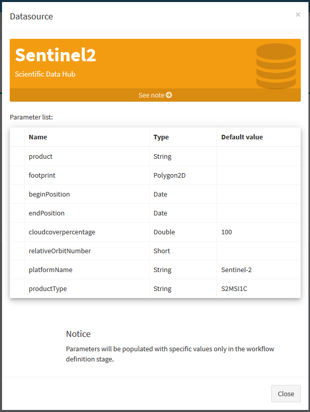
In order to view the parameters of a data source, the button
 {width="0.20799978127734034in"
height="0.20799978127734034in"} can be clicked, and the following dialog
will be open:
{width="0.20799978127734034in"
height="0.20799978127734034in"} can be clicked, and the following dialog
will be open:
 {width="3.6194028871391075in"
height="4.811957567804025in"}
{width="3.6194028871391075in"
height="4.811957567804025in"}
Figure 6‑9 Data source parameters
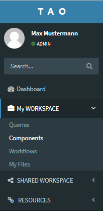
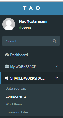
Components#
This interface provides two separated sections for components:
 {width="1.2995516185476816in"
height="2.643478783902012in"}
{width="1.2995516185476816in"
height="2.643478783902012in"}
 {width="1.416382327209099in"
height="2.6608694225721785in"}
{width="1.416382327209099in"
height="2.6608694225721785in"}
Figure 6‑15 Submenus Components
-
The section from the menu 'Shared Workspace' (the right image from 'Figure 6-14 Submenus Components), which allows to the user to view all existing processing components defined in the system, without the possibility to edit those components.
-
The section from the menu 'My Workspace' (the left image from 'Figure 6-14 Submenus Components), which displays only the current user components and allows to the user the following operations:
-
define new processing component
-
edit the parameters of existing processing component
-
delete a processing component
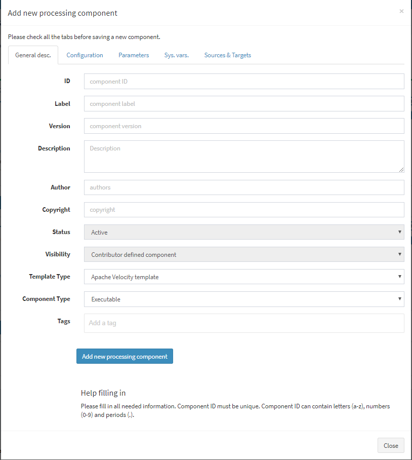
All components defined can be used later in the construction of the workflows. A processing component represents an execution step in a workflow and can be:
-
An OTB application,
-
A SNAP module,
-
A user defined script.
Each processing component is defined by specifying the following information:
-
The label of the component -- represent a short unique identifier for the component,
-
The description -- a text presenting the details about the processing component
-
The version of the component
-
The authors and the copyright
-
The node affinity -- represents the node or list of nodes where this component should be executed. In this way, it can be specified for each component what nodes should be used for its execution due to some constraints: available processors, available memory, dependency software installed on that node etc.
-
Data sources used as input for this component,
-
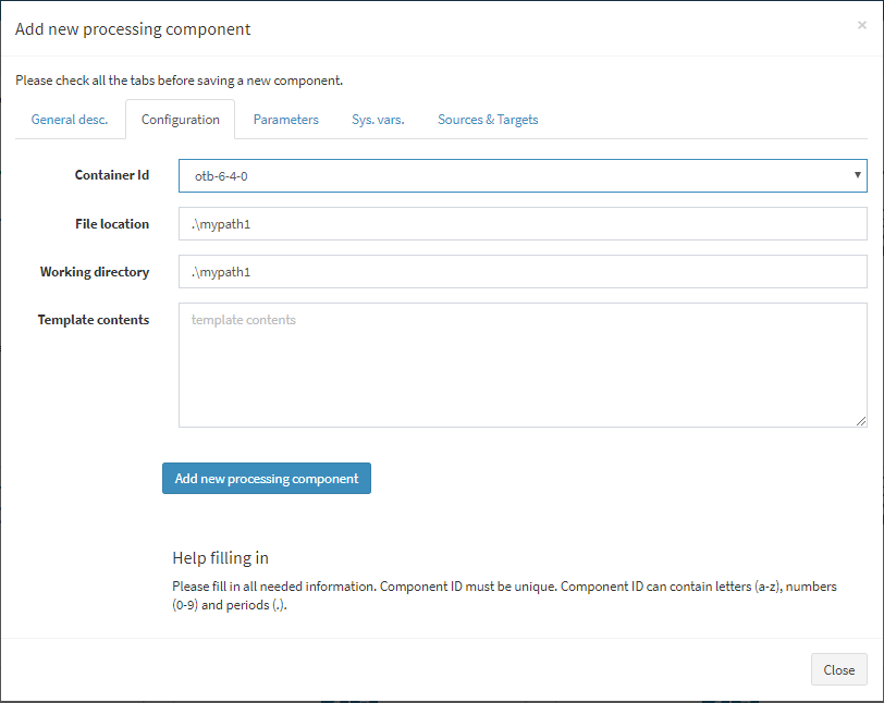
The Docker container ID -- this represents the Docker instance containing the executable of this processing component;
-
The file location of the component;
-
The working directory -- where this component should save its temporary files
-
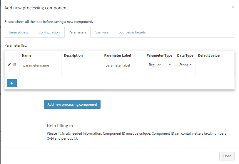
A list of parameters for this component. This is usually the list of parameters supported by the executable that was defined for the component;
-
The template used for the definition of the execution of this component;
-
The visibility of the component. This can be System level, User level or Contributors level.
For adding a new processing component, the user must complete the
following dialogs details, which are displayed after the
 {width="0.12309820647419073in"
height="0.13482174103237096in"} button is pressed :
{width="0.12309820647419073in"
height="0.13482174103237096in"} button is pressed :
 {width="3.9917957130358706in"
height="4.452765748031496in"}
{width="3.9917957130358706in"
height="4.452765748031496in"}
Figure 6‑16 Add a new processing component -- general description
 {width="4.330770997375328in"
height="3.4454155730533684in"}
{width="4.330770997375328in"
height="3.4454155730533684in"}
Figure 6‑17 Add new processing component -- configuration
 {width="4.251645888013998in"
height="2.923332239720035in"}
{width="4.251645888013998in"
height="2.923332239720035in"}
Figure 6‑18 Add new processing component -- parameters
 {width="4.345068897637796in"
height="2.493597987751531in"}
{width="4.345068897637796in"
height="2.493597987751531in"}
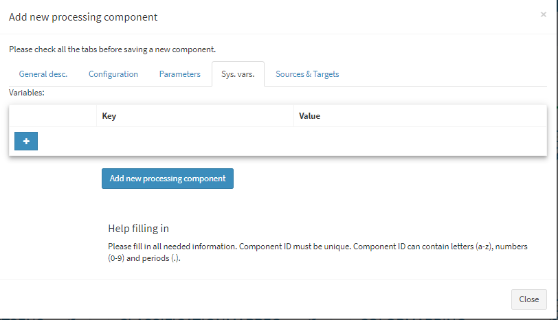
Figure 6‑19 Add new processing component - system variables
 {width="3.2026771653543307in"
height="2.493597987751531in"}
{width="3.2026771653543307in"
height="2.493597987751531in"}
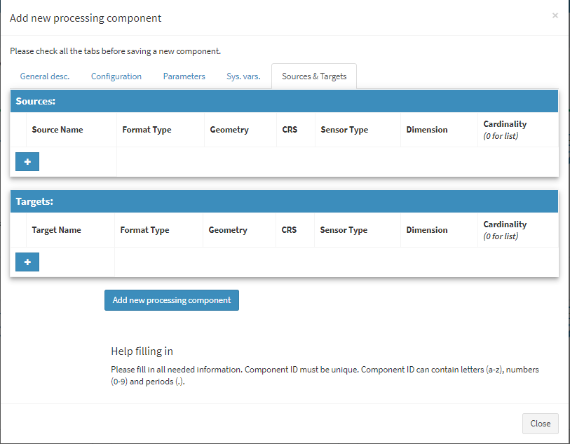
Figure 6‑20 Add new processing component -- source and targets
Queries management#
Queries can be managed from 'Workspace' menu:
 {width="1.7083333333333333in"
height="2.800680227471566in"}
{width="1.7083333333333333in"
height="2.800680227471566in"}
Figure 6‑26 Submenu Queries
This page implements the following functionalities:
-
See all the queries
-
Add a new query
-
Edit queries
-
Execute queries
-
Delete queries
-
Search queries by their name
-
Create a data source component
Queries and query collections#
There are two visualization options for the page. By default, the table
view  {width="0.18333333333333332in"
height="0.16666666666666666in"} is selected.
{width="0.18333333333333332in"
height="0.16666666666666666in"} is selected.
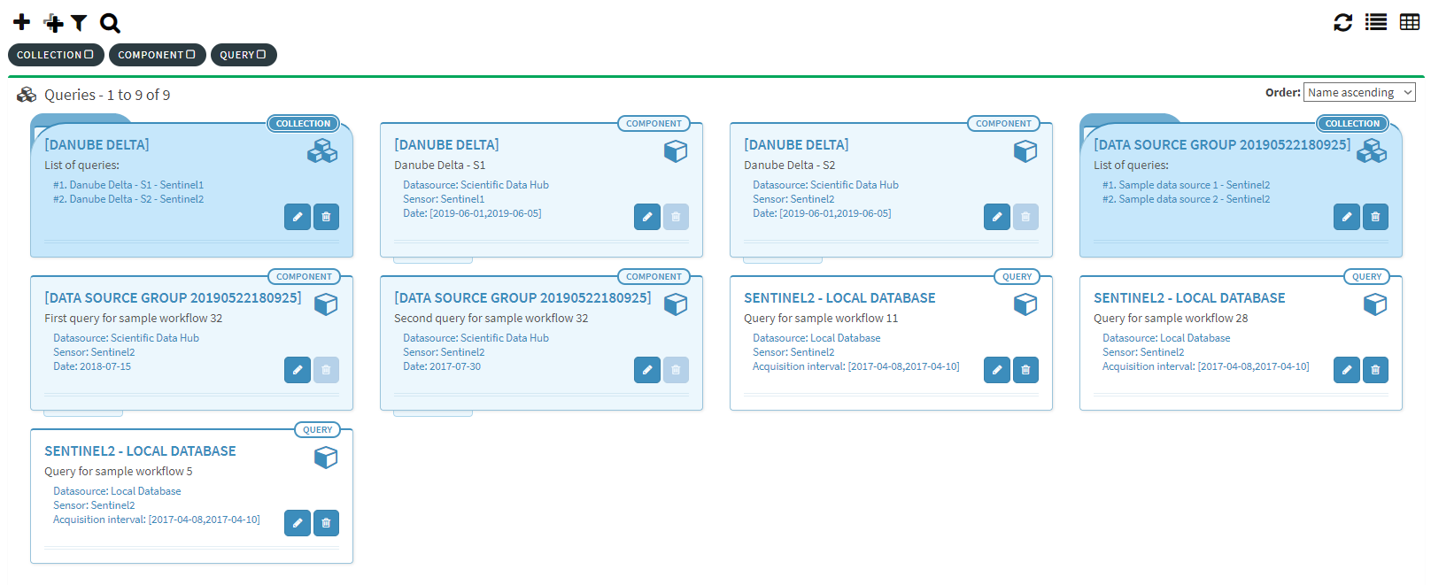 {width="6.496527777777778in"
height="2.657638888888889in"}
{width="6.496527777777778in"
height="2.657638888888889in"}
Figure 6‑27 View all queries and collections
It can be modified in list view by clicking on the icon
 {width="0.2192465004374453in"
height="0.17708333333333334in"} located on the right side of the page.
{width="0.2192465004374453in"
height="0.17708333333333334in"} located on the right side of the page.
Both queries and query collections are displayed together within the same page. There are three types of objects:
-
Query collections
-
Datasource components
-
Simple queries
Each object type has a different look within the grid-view so that the
user may easily distinguish between them. Also, each object has a tag
assigned which allows the user to filter the desired type ("COLLECTION",
"COMPONENT", "QUERY") by using the funnel
 icon.
icon.
The "Query collection" is a collection of queries, as one may guess, but it also includes the datasource components generated for each of the queries within. The object as depicted in the grid-view, shows simple information about the collection: the collection name and the list of queries:
The "Datasource components" displayed in the grid-view are always part of a collection and therefore cannot be deleted directly (the delete button is always disabled). To remove a component, the user must open the associated collection in Edit mode and remove it from there. The information displayed for a component is: the containing collection name, the associated query name and few execution parameters like the datasource, sensor and acquisition date:
The "Simple query" object is a query which can be edited or deleted by the user without having any impact on other objects. The displayed information is: the query name and the main execution parameters, datasource, sensor and acquisition date.
Add new query#
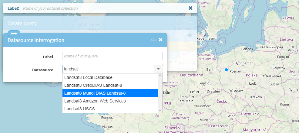
The possibility to add a new query is provided by the pop-up window
displayed when the  icon is pressed. First, a
data source must be selected from the list. It can be done from the
suggestions list where the user can type two or more characters or just
select the desired datasource from the combo box.
icon is pressed. First, a
data source must be selected from the list. It can be done from the
suggestions list where the user can type two or more characters or just
select the desired datasource from the combo box.
 {width="6.496527777777778in"
height="2.5588232720909887in"}
{width="6.496527777777778in"
height="2.5588232720909887in"}
Figure 6‑28 Popup add query
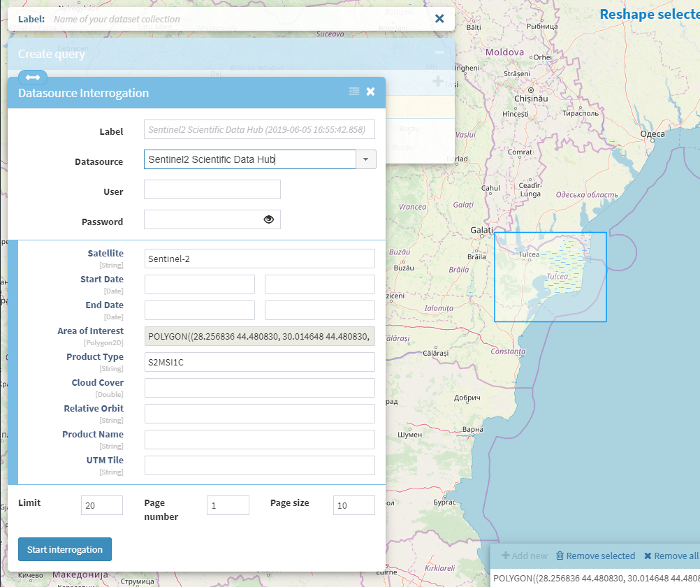
After the datasource is selected, if the label was not already set, it is automatically completed. The list of parameters is displayed below in the same window and it can be different from one datasource to another.
 {width="6.494653324584427in"
height="4.588234908136483in"}
{width="6.494653324584427in"
height="4.588234908136483in"}
Figure 6‑29 Query parameters
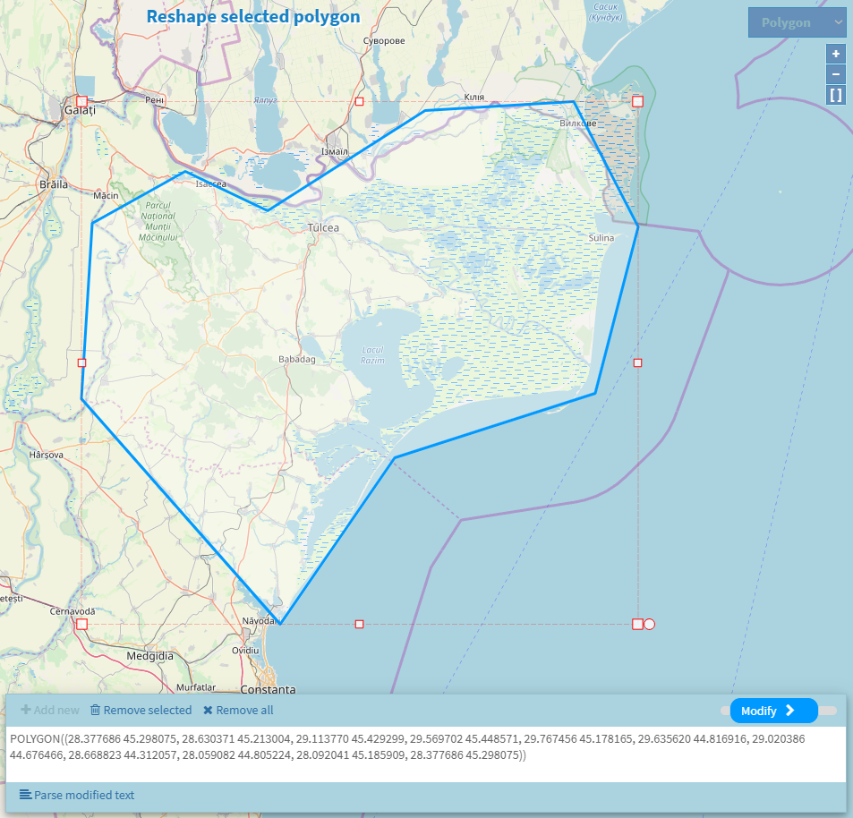
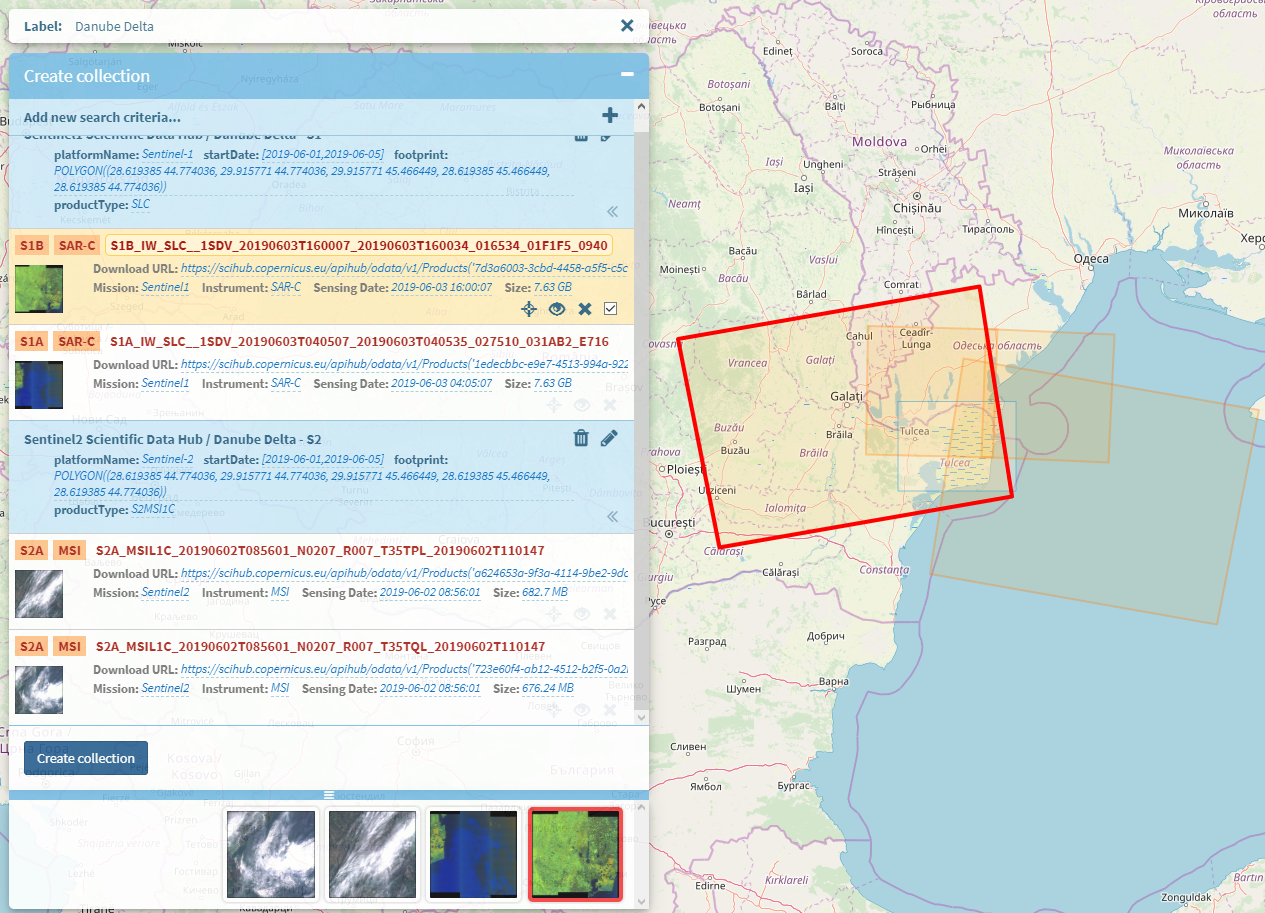
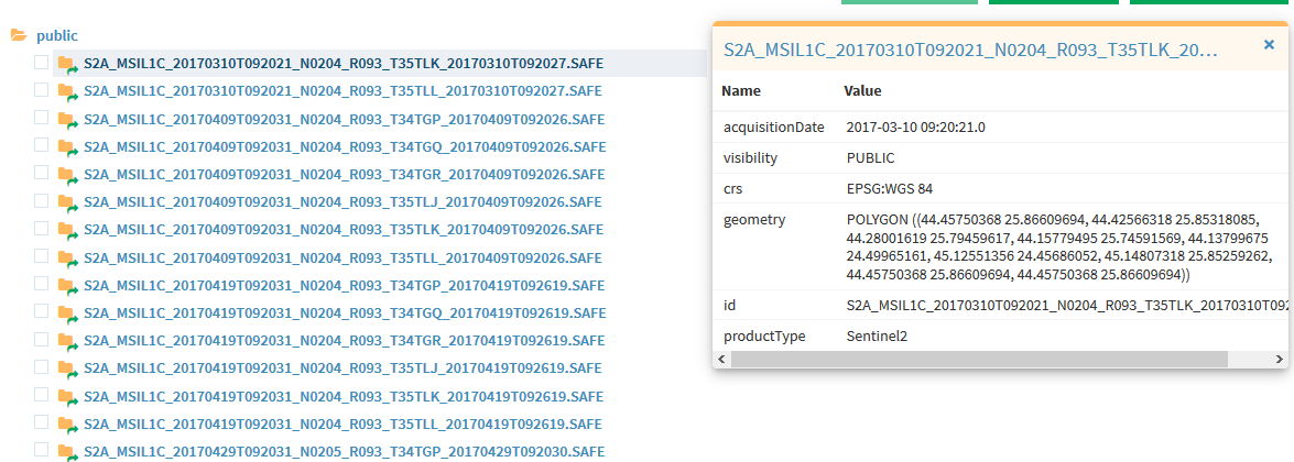
After all the required parameters are filled in (the default values are automatically displayed), the user can start the datasource interrogation in order to get all the available products for the selected set of parameters. The "Area of interest" parameter is mandatory. It can either be selected by drawing a 2D Polygon directly on the map using the included map functionalities, or by filling in the tile name when that parameter is available.
 {width="6.496527777777778in"
height="6.230555555555555in"}
{width="6.496527777777778in"
height="6.230555555555555in"}
Figure 6‑30 Drawing 2D polygon shapes on the map
Execute query#
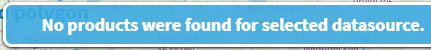
Depending on the selected parameter values, the query execution can
either return a list of products or an empty list, in which case the
following message is displayed
 {width="2.3662773403324584in"
height="0.2745100612423447in"}.
{width="2.3662773403324584in"
height="0.2745100612423447in"}.
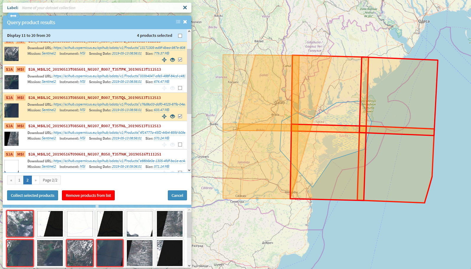
When the execution finishes with a list of products, this list will be displayed in a new window where the user can choose which products to collect for further actions.
 {width="6.496527777777778in"
height="3.713888888888889in"}
{width="6.496527777777778in"
height="3.713888888888889in"}
Figure 6‑31 Query execution results
Each product in the list has a complete set of information including position on map and preview image. A set of controls are also assigned for each product, so the user can easily manage it:
-
locate the product on the map
-
display product extended information
-
preview product image
-
collect the product for future manipulations (download product, create datasource components)
-
remove the product from the list
The bottom section of the window contains a list of thumbnails where the
user can quickly visualize if a product is usable or not. There, the
user can select the list of unusable products and remove them all at
once using the  {width="1.0266666666666666in"
height="0.21318788276465442in"} button.
{width="1.0266666666666666in"
height="0.21318788276465442in"} button.
By clicking on the thumbnail image, a larger preview image will be displayed on top of the map:
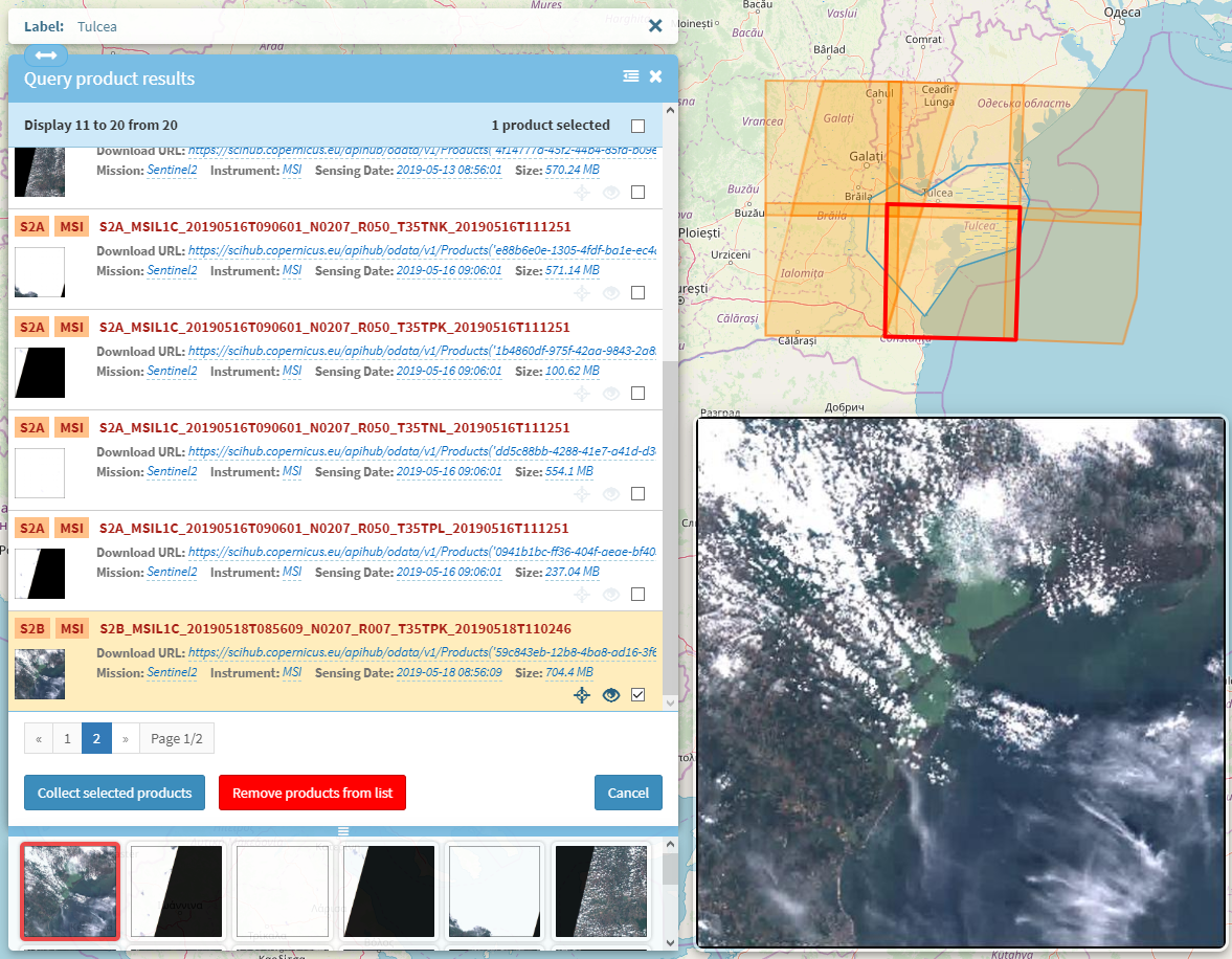 {width="6.496527777777778in"
height="5.05625in"}
{width="6.496527777777778in"
height="5.05625in"}
Figure 6‑32 Product image preview
By clicking on the
 {width="0.22916666666666666in"
height="0.22916666666666666in"} icon, a new window with extended
information about that product will show:
{width="0.22916666666666666in"
height="0.22916666666666666in"} icon, a new window with extended
information about that product will show:
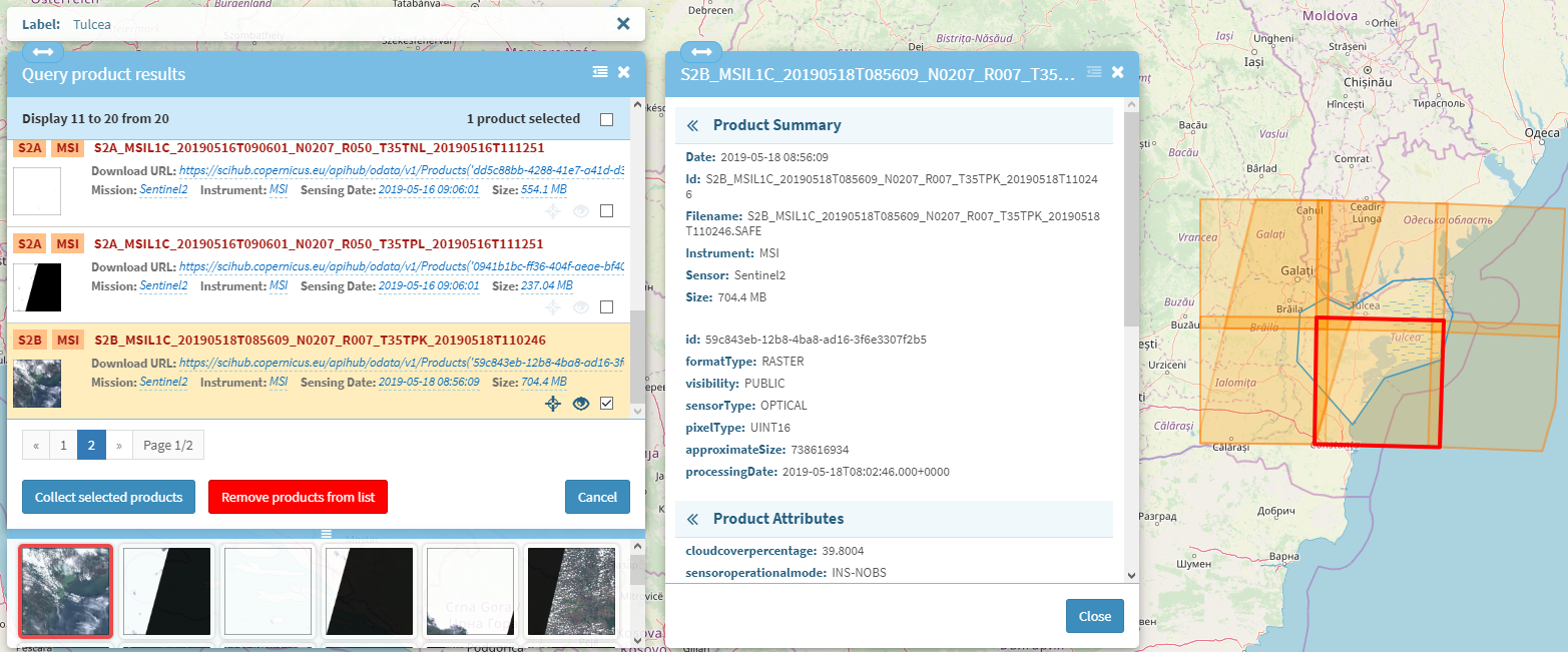 {width="6.496527777777778in"
height="2.7020833333333334in"}
{width="6.496527777777778in"
height="2.7020833333333334in"}
Figure 6‑33 Extended product information
Clicking the  {width="0.22916666666666666in"
height="0.22916666666666666in"} icon will bring into view the product
footprint on the map.
{width="0.22916666666666666in"
height="0.22916666666666666in"} icon will bring into view the product
footprint on the map.
Once the desired products have been selected, the user can hit the
 {width="1.0933333333333333in"
height="0.22984798775153106in"} button in order to finalize the query
for future work. After the button is clicked, the user is redirected to
the final results window where the user can do a final verification on
the list of selected products, save the query, create a datasource
component or download the products. This window is similar to the
execution result window, having similar controls for each product.
{width="1.0933333333333333in"
height="0.22984798775153106in"} button in order to finalize the query
for future work. After the button is clicked, the user is redirected to
the final results window where the user can do a final verification on
the list of selected products, save the query, create a datasource
component or download the products. This window is similar to the
execution result window, having similar controls for each product.
 {width="3.5103805774278216in"
height="4.539215879265092in"}
{width="3.5103805774278216in"
height="4.539215879265092in"}
Figure 6‑34 Query results window
If the user is not happy with the final results, it can always choose to
either delete the current query (by clicking
 {width="0.18934930008748907in"
height="0.17288385826771654in"} icon) and restart the whole process
again beginning with the datasource selection, or edit the results (by
clicking
{width="0.18934930008748907in"
height="0.17288385826771654in"} icon) and restart the whole process
again beginning with the datasource selection, or edit the results (by
clicking  {width="0.17921259842519685in"
height="0.18774606299212598in"} icon), in which case it will be
redirected to the parameters window.
{width="0.17921259842519685in"
height="0.18774606299212598in"} icon), in which case it will be
redirected to the parameters window.
 {width="3.3583880139982503in"
height="1.3609459755030622in"}
{width="3.3583880139982503in"
height="1.3609459755030622in"}
Figure 6‑35 Query summary header
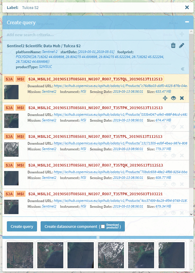
Create datasource component#
When the user is happy with the results, the query can be saved by
clicking the  button. The user can also choose to create a datasource component from
all the products in the list, including the downloading option, by using
the
button. The user can also choose to create a datasource component from
all the products in the list, including the downloading option, by using
the 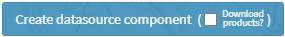 button.
This component will be linked to the newly created query, and this is
very useful because the list of products will automatically be
repopulated when the user chooses to edit the query again at a later
date.
button.
This component will be linked to the newly created query, and this is
very useful because the list of products will automatically be
repopulated when the user chooses to edit the query again at a later
date.
Add new query collection#
To create a collection of queries, the user must click the
 {width="0.2254899387576553in"
height="0.24283573928258967in"} icon on the main grid-view page. A new
window will show up with an empty list of queries. Using the available
{width="0.2254899387576553in"
height="0.24283573928258967in"} icon on the main grid-view page. A new
window will show up with an empty list of queries. Using the available
 {width="0.18627515310586176in"
height="0.1951454505686789in"} button, the user will start the process
of adding new queries to the collection, one at a time, process which is
identical to query creation that is described just above.
{width="0.18627515310586176in"
height="0.1951454505686789in"} button, the user will start the process
of adding new queries to the collection, one at a time, process which is
identical to query creation that is described just above.
The collection name will be typed in the Label field at the top of the
window. The products selected by the user for the final list will be
grouped by query as can be seen in the following image. Each query
within the collection can be edited or discarded using the associated
{width="0.18934930008748907in"
height="0.17288385826771654in"} and
{width="0.17921259842519685in"
height="0.18774606299212598in"} buttons.
 {width="6.496527777777778in"
height="4.688888888888889in"}
{width="6.496527777777778in"
height="4.688888888888889in"}
Figure 6‑36 Query collection
The newly created collection can be saved by clicking the
 {width="0.9117639982502187in"
height="0.2656321084864392in"} button. For each query a new datasource
component is automatically created and they will all show up separately
in the list of objects in the main page.
{width="0.9117639982502187in"
height="0.2656321084864392in"} button. For each query a new datasource
component is automatically created and they will all show up separately
in the list of objects in the main page.
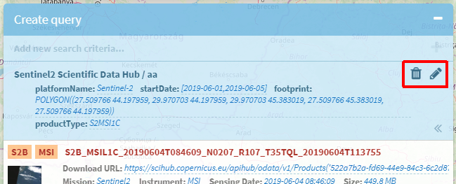
Edit query/collection#
A query or a collection of queries can be modified by pressing the
 {width="0.22916666666666666in"
height="0.22916666666666666in"} icon in the main page. A corresponding
pop window will be opened, providing the ability to update the query or
modify the collection, to execute it and eventually download other
products resulted from the new execution.
{width="0.22916666666666666in"
height="0.22916666666666666in"} icon in the main page. A corresponding
pop window will be opened, providing the ability to update the query or
modify the collection, to execute it and eventually download other
products resulted from the new execution.
While editing a collection, if the user modifies the footprint for one of the queries, it will be warned to change the footprint for all other queries in the collection and execute them again in order to get consistent results. The warning consists in highlighting the query header and adding two options the user can choose from:
-
Re-interrogate the datasource -- user will be redirected to parameters window where the query execution can be restarted. The footprint parameter is automatically filled in to match the new value.
-
Restore the footprint -- user will be prompted to confirm changing the footprint to its initial value.
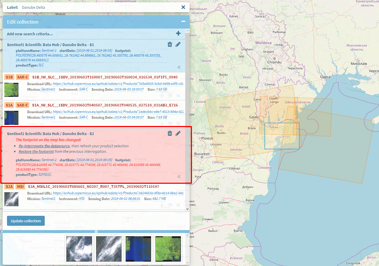 {width="6.496527777777778in"
height="4.5680555555555555in"}
{width="6.496527777777778in"
height="4.5680555555555555in"}
Figure 6‑37 Footprint consistency warning
Remove query/collection#
The user can simply delete a query or a collection of queries by
clicking on the  {width="0.21875in"
height="0.2355774278215223in"} icon and confirming the action in the
confirmation box displayed.
{width="0.21875in"
height="0.2355774278215223in"} icon and confirming the action in the
confirmation box displayed.
To remove a datasource component which is attached to a collection, the user must open that collection in Edit mode and remove the query associated with the datasource component.
Workflow management#
From this interface, the user has the possibility to edit a workflow by adding the desired data source to be used as the initial data provider in the workflow and also to chain the desired processing modules. The chaining of the modules is performed by the user by drag and dropping the available processing components on the drawing canvas and chain them using directed connectors.
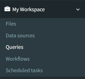
The workflows management is accessible via the "WORKFLOWS" sub-menu option under the menu 'My Workspace':
 {width="1.6463812335958006in"
height="2.84375in"}
{width="1.6463812335958006in"
height="2.84375in"}
Figure 6‑38 Workflows menu
The list of all workflows visible by the current user are displayed via the "All workflows" menu option:
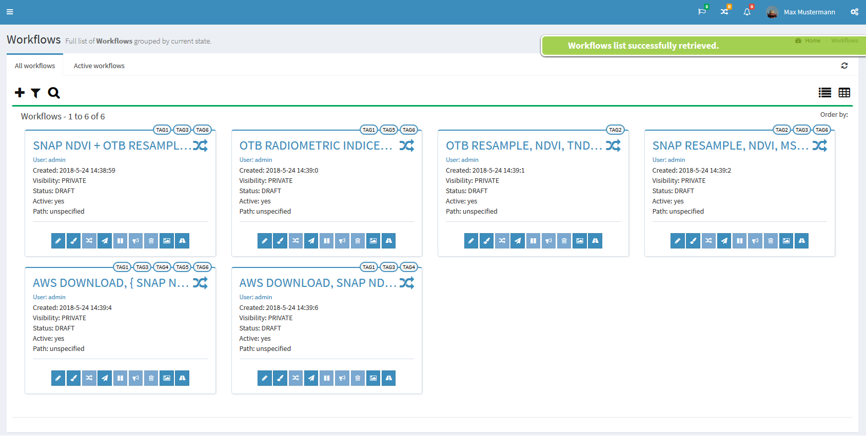
Figure 6‑39 View all workflows
The possible actions are:
-
add a new workflow
-
filter workflows by tag
-
search workflows by their name
-
view details of an existing workflow
-
re-design existing workflow
-
clone workflow
-
execute a workflow
-
publish a private workflow
-
delete workflow
-
view workflow execution results
-
view workflow execution trace
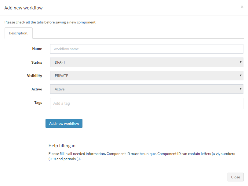
For adding a new workflow, the following details must be filled in, except the input tags which is not mandatory and can be edit later:
 {width="4.849057305336833in"
height="3.651060804899388in"}
{width="4.849057305336833in"
height="3.651060804899388in"}
Figure 6‑40 Add new workflow
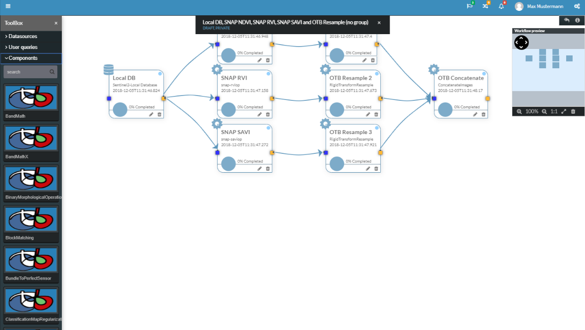
After these details are completed, the design of workflow must be done,
by choosing a datasource from the available ones and chaining processing
components, actions which are possible from the page which is displayed
by clicking the  {width="0.1981386701662292in"
height="0.2117169728783902in"} icon:
{width="0.1981386701662292in"
height="0.2117169728783902in"} icon:
 {width="5.367924321959755in"
height="3.0284372265966755in"}
{width="5.367924321959755in"
height="3.0284372265966755in"}
Figure 6‑41 Design workflow
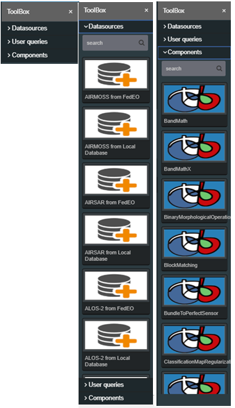
The workflow design toolbox components are grouped into 3 categories:
 {width="3.0754713473315833in"
height="5.350228565179353in"}
{width="3.0754713473315833in"
height="5.350228565179353in"}
Figure 6‑42 Workflow design -- Toolbox
For adding a datasource or a processing component into a workflow, the user can drag&drop it from the toolbox list. Also, for the processing components, the user has the possibility to search between all components by theirs names, using the search field above the list of processing components.
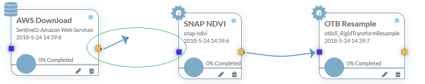
For chaining a datasource to a processing component, or chaining a processing component to another processing component, the workflow nodes output and input connectors must be chained. The output connectors are represented in orange and the input connectors are represented in blue. For drawing a link from an output connector (of a source component) to an input connector (of a target component), the user should click on the orange output connector of the source component and drag the mouse until the blue input connector of the target component:
 {width="6.496527777777778in"
height="1.288888888888889in"}
{width="6.496527777777778in"
height="1.288888888888889in"}
Figure 6‑43 Workflow nodes chaining
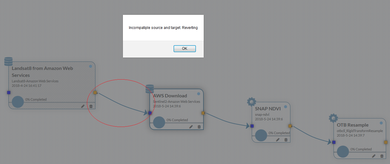
If two components cannot be chained, an error message is displayed:
 {width="6.496527777777778in"
height="2.7354166666666666in"}
{width="6.496527777777778in"
height="2.7354166666666666in"}
Figure 6‑44 Workflow incompatible chaining
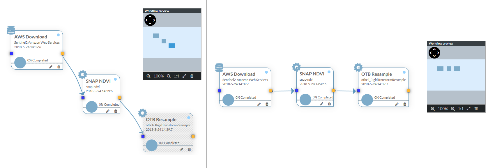
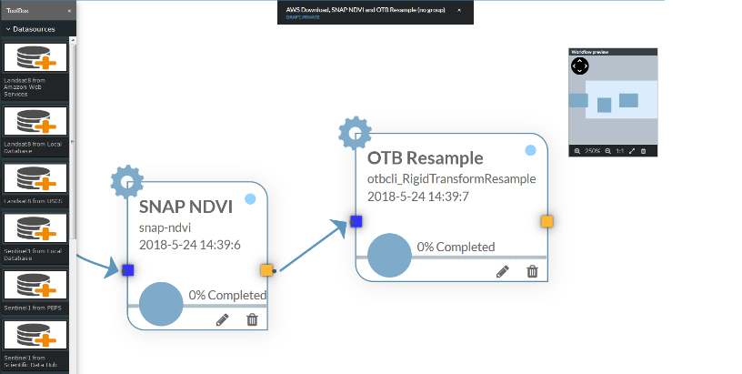
For big workflows, the user has the possibility to visualize the position of nodes by using the workflow preview map that will also include the nodes that are not currently visible on the screen (in the case where the user zoomed in the design canvas):
 {width="6.496527777777778in"
height="2.2368055555555557in"}
{width="6.496527777777778in"
height="2.2368055555555557in"}
Figure 6‑45 Workflow preview map
 {width="3.7010279965004376in"
height="1.865744750656168in"}
{width="3.7010279965004376in"
height="1.865744750656168in"}
Figure 6‑46 Workflow preview map (node not visible on screen)
[Note:]{.underline}
Workflow designer automatically saves all changes that are made by the user (reposition nodes, adding links, zoom, canvas position, etc.).
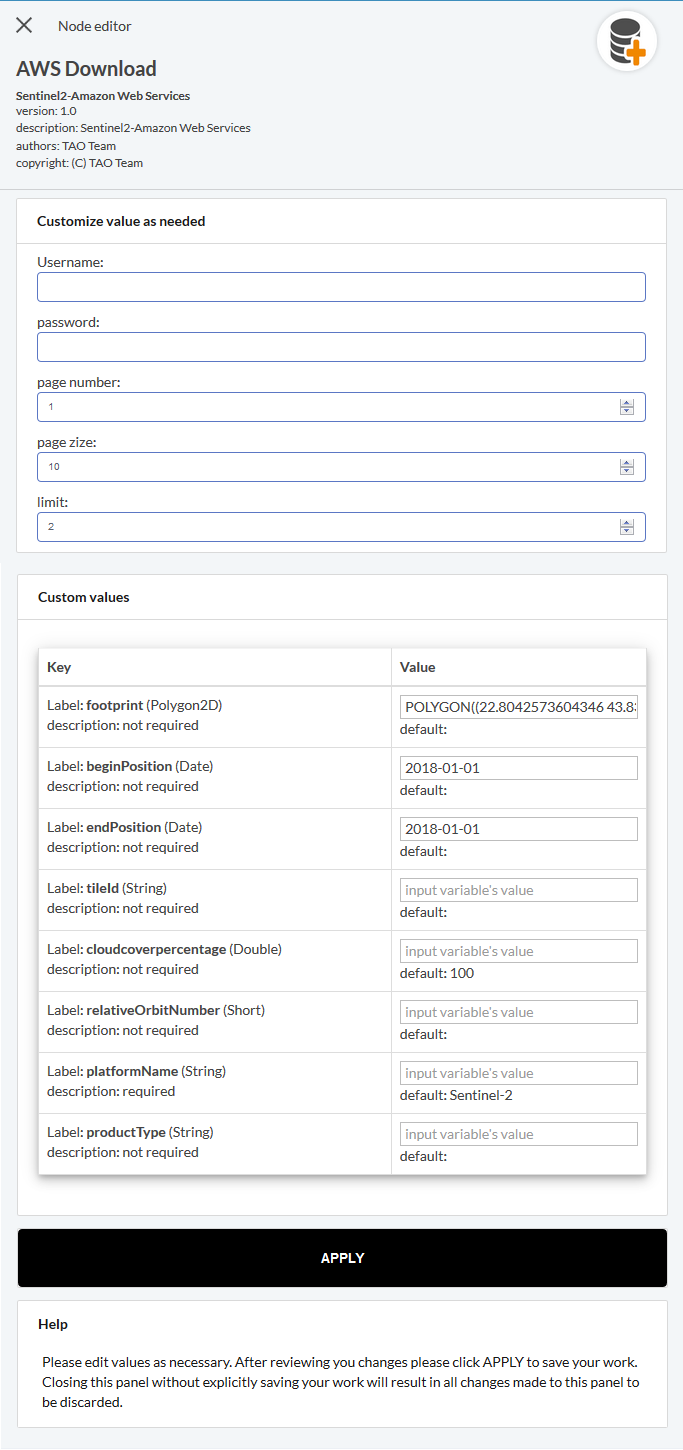
After the workflow nodes design, the parameters configuration for a certain workflow node can be done by clicking on the pencil button of that node:
 {width="2.7094291338582677in"
height="5.752000218722659in"}
{width="2.7094291338582677in"
height="5.752000218722659in"}
Figure 6‑47 Workflow node parameters configuration
Files#
A view of the user files and products can be seen in the page 'Files' (submenu located under the menu 'Workspace'):
 {width="1.551687445319335in"
height="2.7395833333333335in"}
{width="1.551687445319335in"
height="2.7395833333333335in"}
The view presents, in a tree fashion, three categories of files:
-
Products downloaded from external sources
-
Outputs of executed workflows
-
Files (other than rasters) that can be used in workflows
For the input products, if capable, the system can display brief metadata information:
 {width="6.489583333333333in"
height="2.3229166666666665in"}
{width="6.489583333333333in"
height="2.3229166666666665in"}
Figure 6‑50 Products metadata
The actions that can be taken here are:
-
Upload files (but not products)
-
Download files (and products)
-
Import products
-
Create a product list query to be used in workflows.
Files can be deleted from this page by clicking on the file and
then on the  {width="0.8645833333333334in"
height="0.22713582677165353in"} button.
{width="0.8645833333333334in"
height="0.22713582677165353in"} button.
 {width="6.489583333333333in"
height="1.65625in"}
{width="6.489583333333333in"
height="1.65625in"}
The 'Create query' button will be available when a product is selected.
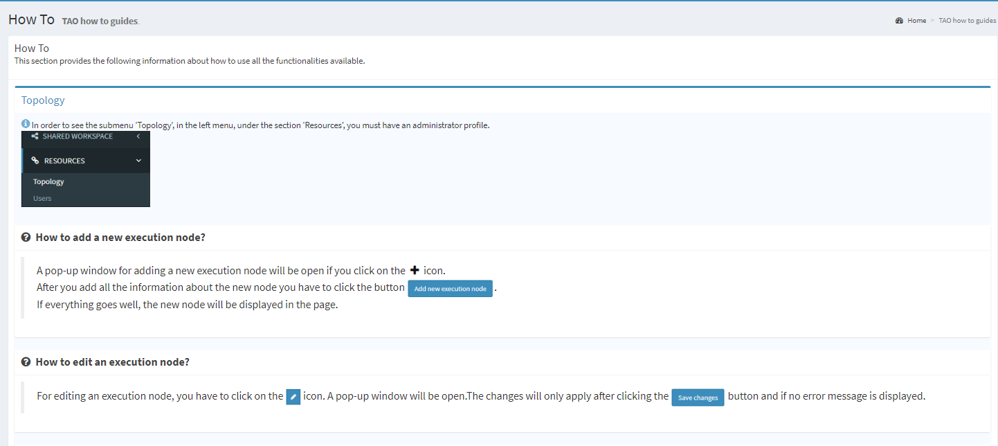
Accessing 'How to' section#
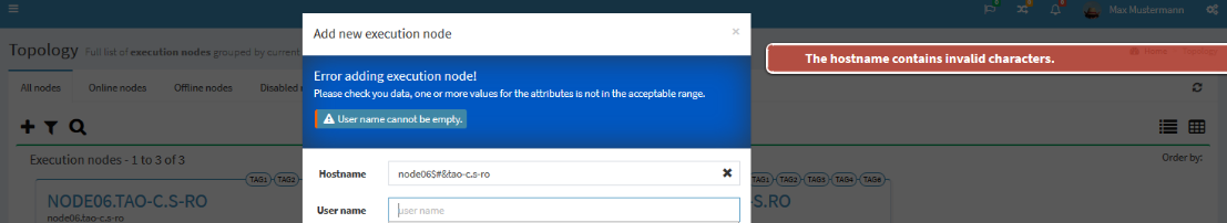
The 'How to' describes the steps necessary to perform an action. In this section the user can find easily the answers to his questions. For example, if the user has a question about how to add a new executing node, he will find the answer selecting the panel 'Topology'.
 {width="6.496527777777778in"
height="2.901388888888889in"}
{width="6.496527777777778in"
height="2.901388888888889in"}
Figure 6‑52 How to
This page can be seen like a short overview of this document 'TAO Interaction' section.